The Kentucky Fried Chicken (KFC) logo, showcasing the unmistakable image of Colonel Harland Sanders, has been instrumental in defining the company’s brand identity and driving its global success. Its evolution and enduring presence have been at the heart of KFC’s marketing strategies and worldwide recognition.
The Evolution of the KFC Logo
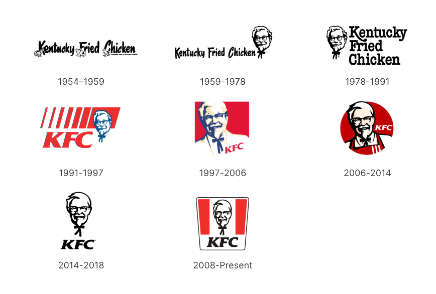
The Kentucky Fried Chicken logo, featuring Colonel Sanders, has evolved significantly since its debut in 1952. Each redesign captures contemporary design trends and reflects the brand's growth while preserving the founder's iconic image.
1954–1959: The Birth of KFC's First Logo

The original KFC logo showcased the brand name “Kentucky Fried Chicken” in a handwritten-style font. Additionally, it featured four chickens emerging from their eggs, positioned beside the capital letters.
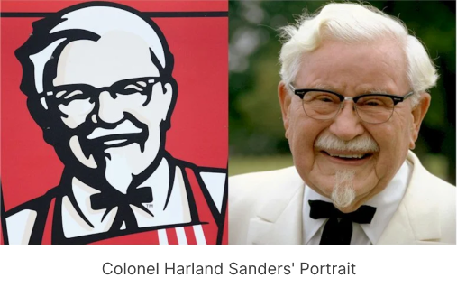
1959-1978: Add Colonel Sanders' Portrait

In 1959, KFC added Colonel Sanders's face to its logo, giving the brand a more personal and unique identity. The redesign featured the Colonel's friendly portrait, wearing his famous white suit and black bow tie. This change highlighted KFC's authenticity and tradition, helping it stand out in the fast-food industry.
1978-1991: Modernized Typography and Layout
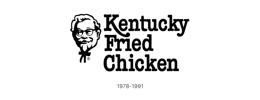
The first logo redesign of 1978 placed the emblem to the left of the wordmark, which was now arranged across three tiers with enlarged lettering. The typeface was updated, featuring an elongated tail on the “K” as its standout element.
1991-1997: Abbreviated as 'KFC' with vibrant red
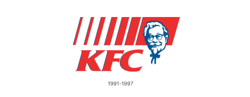
In 1991, Kentucky Fried Chicken changed its name to "KFC." The colors shifted to a vibrant red, aligning with the visual marketing of fast-food brands. The letters "KFC" were bold and italic, with sharp edges. Red stripes adorned the top, with Colonel Sanders' face centered on the largest red stripe.
1997-2006: Emphasizing Colonel Sanders as the Brand Icon
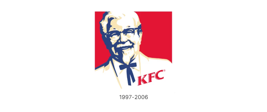
In 1997, KFC redesigned its logo to feature a square shape with a more detailed portrait of Colonel Sanders wearing a tuxedo. The logo included a small red "KFC" wordmark to emphasize the brand.
This redesign shifted the focus from the text to the Colonel's image, making him the main symbol of the brand. This change helped people connect with the brand more strongly and recognize it more easily.
2006-2014: A More Casual and Approachable Look
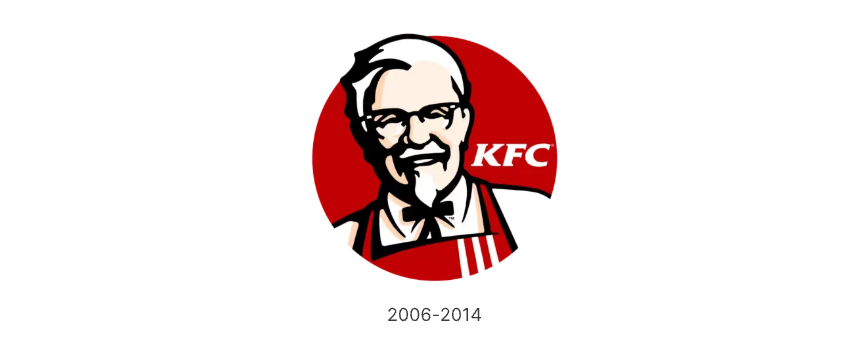
The 2006 logo update showed Colonel Sanders inside a deep red circle. He was drawn with more detail and shown wearing an apron, giving the logo a more relaxed and casual feel. The red-and-white colors stayed the same, but the design was made simpler and more modern.
2014-2018: Minimalist and Nostalgic

In 2014, KFC introduced a streamlined monochrome logo, spotlighting the Colonel’s head above the bold, italicized KFC wordmark in a clean sans-serif font. This design aimed to evoke nostalgia while refining the brand’s visual identity.
2018-Present: Modern Bucket-Inspired Logo

The latest logo redesign showcases a distinctive trapezoidal shape, evocative of a classic KFC bucket. The refined typography features smoother edges, adding warmth while retaining a sleek, modern aesthetic. This update seamlessly blends vibrant colors with unique elements, all while upholding the brand’s signature flat and minimalist visual identity.
Advantages of Portrait Logos
Brand Recognition – A human face creates an emotional connection, making the brand more relatable and memorable.
Authenticity and Trust – Featuring a real person, especially a founder, conveys legacy and credibility.
Differentiation – A portrait logo sets a brand apart from competitors relying solely on abstract symbols or wordmarks.
Marketing Versatility – It provides a strong visual anchor that can be adapted across different branding materials.
Storytelling – A portrait logo allows brands to embed a personal or historical narrative into their visual identity.
Other Brands Using Portrait Logos
1. Mentholatum

Mentholatum, a renowned healthcare and skincare brand, features a portrait of a nurse, symbolizing care, trust, and expertise. This human touch has helped solidify its presence in the healthcare industry.
2. Quaker Oats

Quaker Oats' logo prominently features a friendly, wholesome Quaker man, reinforcing the brand’s message of purity, tradition, and healthy living.
3. Wendy’s

Wendy's logo features a stylized portrait of the founder’s daughter, Wendy Thomas. This familial touch adds warmth to the brand and emphasizes its home-style food approach.
Try Our Portrait-to-Logo Generator!
Looking to craft a memorable and personalized brand identity like KFC, Quaker Oats, or Wendy’s?
Try our Portrait-to-Logo Generator today and create a logo that truly sets your brand apart! Follow our step-by-step guide to learn how to create your unique portrait logo.