Nike and Adidas demonstrate strikingly different approaches to their logos. Nike’s Swoosh often stands alone, symbolizing motion and success independently, whereas Adidas rarely (if ever) separates its symbol from the word “Adidas.” This contrast reveals one of the most crucial insights for growing brands: deciding whether to feature a standalone symbol or to adopt a combination logo—also known as a combination mark—that merges symbol and text.
Comparing Nike and Adidas Logo Usage
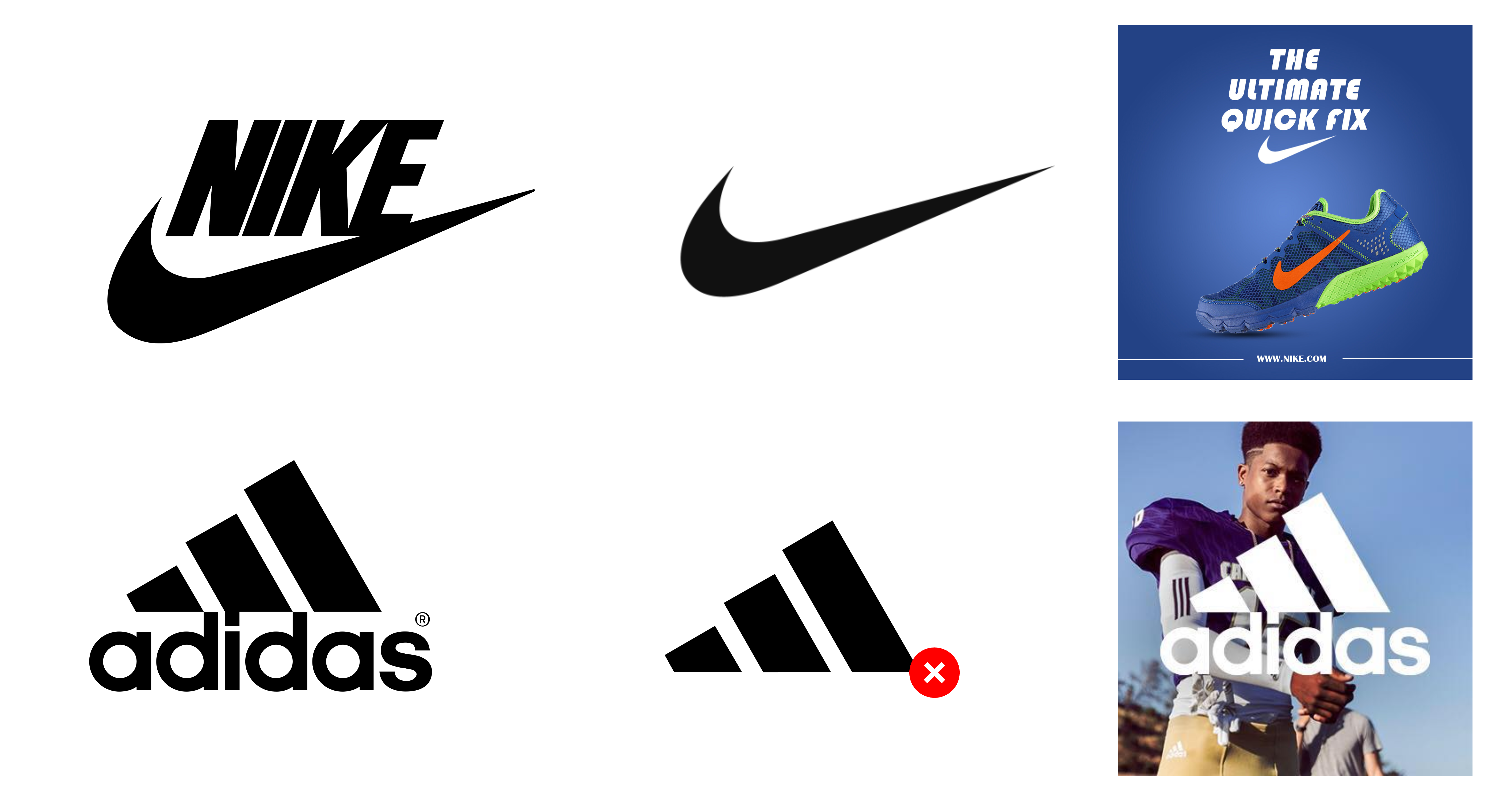
Adopting a standalone symbol like Nike’s Swoosh can be tempting for emerging companies, particularly if you’re aiming for instant visual impact. However, building recognition for a new shape requires extensive marketing efforts. Nike invested decades into high-visibility sponsorships and advertising to embed the Swoosh in people’s minds worldwide.
If you do not have comparable resources, relying on a combination logo is typically the safer, more effective approach. Including the brand’s name alongside the symbol reinforces immediate verbal recall—people see the symbol and read (or think) “This is Adidas,” not just a cool shape.
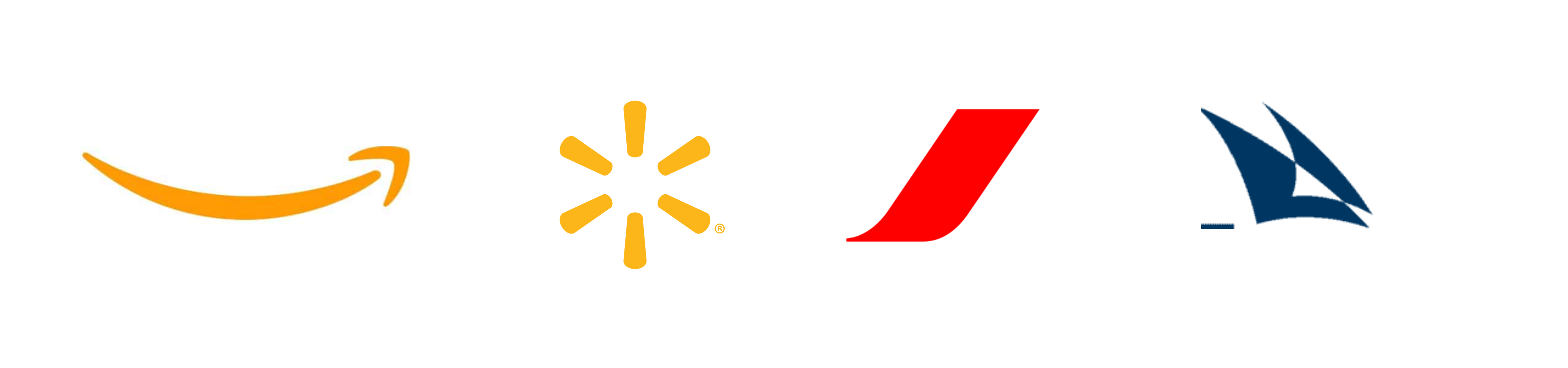
Test: Can You Identify These Symbols Without Their Brand Names?
thinking …
Here is the answer:
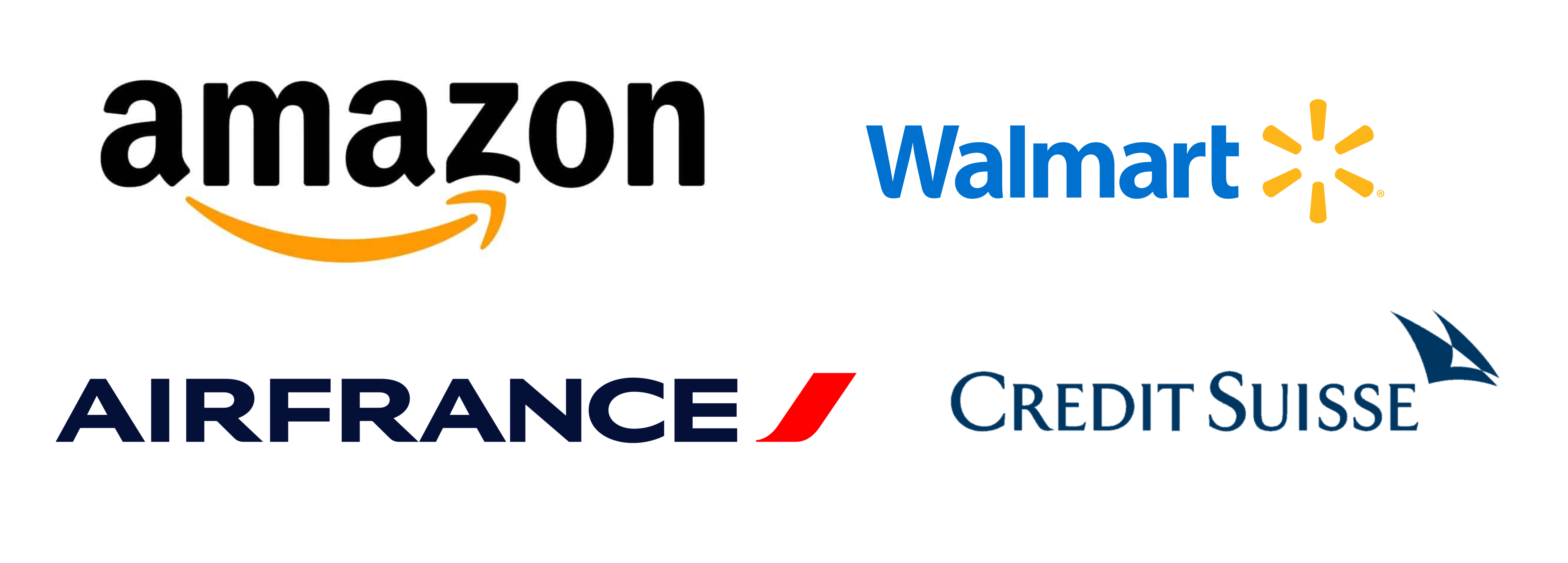
This is why brands like Amazon, Walmart, Air France, and Credit Suisse consistently pair their symbols with their logotypes.
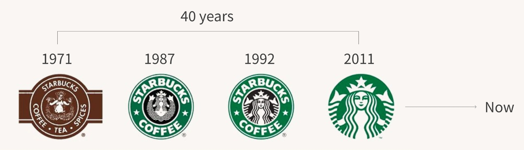
Starbucks Gradually Removed Its Brand Name from Its Logo over 40 Years
Starbucks offers a compelling example of gradual logo evolution. It began with a combination mark: the Siren symbol surrounded by “Starbucks Coffee.”
Over time, Starbucks methodically reduced the text until the Siren alone remained, confident that consumers would still identify the brand. But this took years—by the time Starbucks removed its wordmark, the Siren was a cultural icon.
For more recent or smaller-scale brands, the priority should be ensuring potential customers know who you are and how to say your name. A visually impressive but text-free logo might look polished, but it can hinder word-of-mouth referrals when consumers cannot recall the name behind the design.
By embracing a combination logo, you bridge the gap between symbol and brand identity, making it easier for audiences to refer to your product or service.
Conclusion
Consider your brand's development stage when choosing a logo approach. Nike uses a standalone symbol after decades of marketing investment, while Adidas pairs its symbol with text. Starbucks shows how a brand can evolve from a combination mark to a symbol over time.
For most brands, a combination logo offers the best path to building recognition and loyalty, helping customers connect your symbol with your name.You can find more combination logo ideas on SologoAI's logo idea channel: Combination logo ideas | SologoAI
Now, create your combination logo with combination logo maker.