Visual Evolution of Grok's Logo
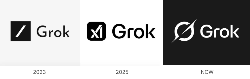
Since its inception in 2023, Grok, the AI chatbot developed by Elon Musk's xAI, has undergone notable logo transformations. At first, Grok's icon always remained consistent with the logo of the xAI company that created it. The initial design featured a bold, minimalist black square with a white forward slash, paired with the word "Grok" in a sleek, sans-serif typeface. This design emphasized clarity and simplicity, aligning with the brand's tech-oriented identity.
In early 2025, the logo evolved to incorporate a stylized "X" and "I" within a rounded black square, followed by "Grok" in a bold, contemporary font. This iteration aimed to reflect advanced technology and next-generation thinking, enhancing the brand's futuristic appeal.
By February 2025, Grok finally has its own logo, adopting a Saturn-like monogram "G" inspired by the concept of singularity and the enigmatic nature of black holes. This design choice signifies a deeper understanding and exploration of the universe, resonating with Grok's mission to provide profound insights.
The Rationale Behind the Saturn-Inspired Monogram
The shift to a Saturn-like monogram "G" is a strategic move to establish a unique and memorable brand identity. This design encapsulates the initial letter of the brand name, creating a direct association with Grok. The celestial theme reflects the brand's commitment to exploring the vastness of artificial intelligence and understanding the universe's complexities.
Building Long-Term Brand Equity Through Distinctive Design
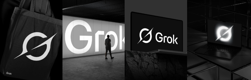
Adopting a distinctive monogram not only differentiates Grok from competitors but also fosters brand recognition and recall. A unique logo serves as a visual anchor, enhancing customer loyalty and trust over time. By moving away from generic AI symbols and embracing a personalized emblem, Grok positions itself as a forward-thinking and innovative brand in the AI industry.
Conclusion
The evolution of Grok's logo from a minimalist design to a Saturn-inspired monogram "G" reflects a strategic effort to build a distinctive and memorable brand identity. This transformation underscores the importance of aligning visual elements with the brand's mission and values, effectively enhancing long-term brand equity.
Inspired by Grok's logo transformation? Create your own unique monogram logo using this AI-powered generator: https://www.sologo.ai/ai-logo-generator/monogram-logo-maker/