Did You Notice YouTube's Logo Has Changed?
Color Adjustment:
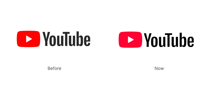
The red play button, a central element of the YouTube logo, has transitioned from its original deep red hue (#fe0000) to a slightly brighter pinkish-red (#ff1a47).
This subtle change modernizes the logo while maintaining brand recognition.
Modification of the Icon's Contour:
The outer contour of the play icon has been compressed in height, giving it a sleeker appearance. This adjustment reflects contemporary design trends favoring minimalist and streamlined aesthetics.
Font and Color Updates:
The wordmark continues to utilize the Alternate Gothic typeface but now features adjusted letter spacing and reduced letter height. These changes enhance visual harmony between the text and the play icon.
Additionally, the font color has been updated from a dark gray (#282828) to pure black, increasing contrast and readability.
Why Brands Fine-Tune Logos
Adaptation to Trends: Design trends evolve, such as flat design, minimalism, and gradients. Fine-tuning ensures logos do not appear outdated.
Improved Versatility: Logos need to work well across various mediums, from large billboards to tiny app icons.
Digital Optimization: Many legacy logos were not designed with digital platforms in mind. Fine-tuning makes them more screen-friendly.
Subtle Modernization: Small updates keep a brand fresh without alienating its existing audience or losing recognition.
Global Appeal: Simplified, universal designs are easier to recognize across cultures and languages.
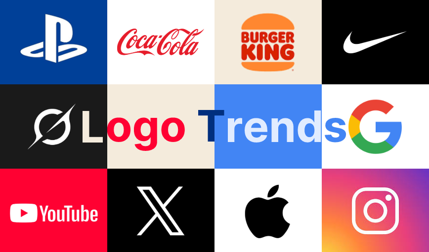
They Also Did This
Many major brands have implemented subtle logo refinements over the years to stay modern while maintaining brand recognition. Here are a few notable examples:
Google's Sans-Serif Transformation
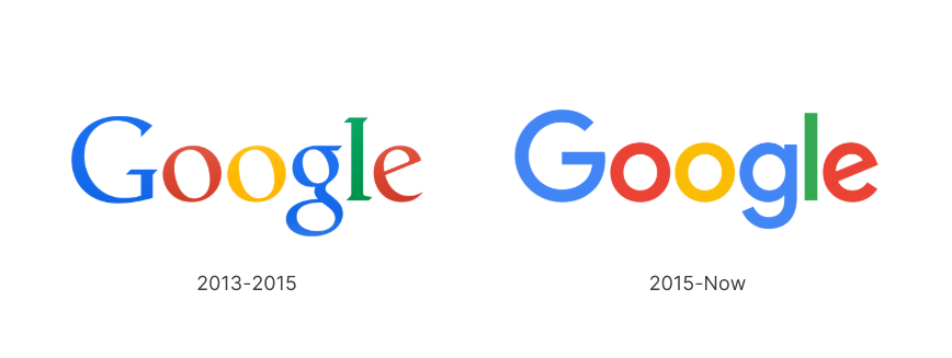
Google transitioned from a serif typeface to a sans-serif typeface in 2015. The colors were brightened, and the letters became slightly bolder.
It's aimed to make the logo more modern, playful, and versatile across both digital and physical media. The sans-serif font also improved its readability on smaller screens, aligning with mobile-first design trends.
OpenAI's Subtle Logo Refinement
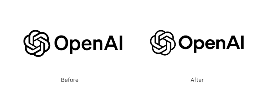
OpenAI made slight refinements to its logo by adjusting the spacing and proportions of its emblem and typography. These changes enhanced clarity and ensured better scalability across digital platforms. The update maintained OpenAI’s futuristic and innovative identity while optimizing the logo for improved readability and recognition in various applications.
Learn more about the design of OpenAI’s logo in this blog: OpenAI Logo Design.
BMW's Digital-Friendly Update
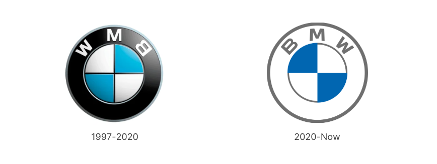
BMW updated its logo by making it flat, removing the black outer ring, and introducing transparency. The blue and white Bavarian colors were brightened slightly.
The redesign reflected BMW’s evolution into a digital-first brand and reinforced its commitment to sustainability and modernity.
Starbucks' Simplified Siren
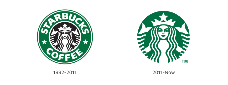
Starbucks removed the wordmark ("Starbucks Coffee") from its logo, leaving just the mermaid icon.
The mermaid was also fine-tuned with cleaner lines and balanced proportions.
The change reflected Starbucks' confidence in its brand recognition. It also simplified the logo for a global audience, focusing on the core visual identity.
Instagram's Gradient Evolution
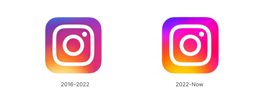
In 2022, Instagram gave its gradient-based logo a slight refresh. The colors became more vibrant, making the design pop with better contrast and visibility. They also fine-tuned the lighting and shadows to create a sleeker, more polished look.
The goal is to keep the brand feeling fresh and modern while ensuring it stays instantly recognizable across all digital platforms.
For new brands
For creators and brands just starting out, we should embrace these strategic design changes that align with contemporary aesthetics, such as the growing trend of flat logos, providing audiences with a smoother, more cohesive brand experience across all digital platforms
Create a logo inspired by the YouTube brand
Inspired by YouTube's thoughtful logo refinements? Try creating your own modern, flat logo with SologoAI generator and bring your brand identity to life!