Evolution of Messenger's Brand Identity
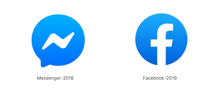
Meta has recently updated Messenger's icon, replacing the blue-red gradient design from 2020 with a simple solid blue version. This new design closely resembles the all-blue logo used during 2018–2020.
The change aligns with Zuckerberg's "return to Facebook's roots" initiative. Throughout its history, Messenger's brand has undergone several key transformations:
2018 Refined Curves and Rounded Angles
The new blue bubble logo featured refined curves and rounded angles throughout its design, including the bubble's bottom triangle and the lightning symbol inside that represents speed and immediacy. This solid blue bubble icon reflected its close connection with Facebook's main brand.
2020 Blue-To-Pink Gradient Design
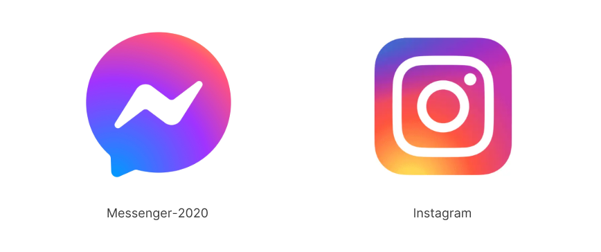
Introduced a blue-to-pink gradient design, signaling Meta's strategy to distance Messenger from Facebook while strengthening its ties with Instagram. This shift demonstrated the company's move toward more dynamic user engagement.
2025 Return To Roots:
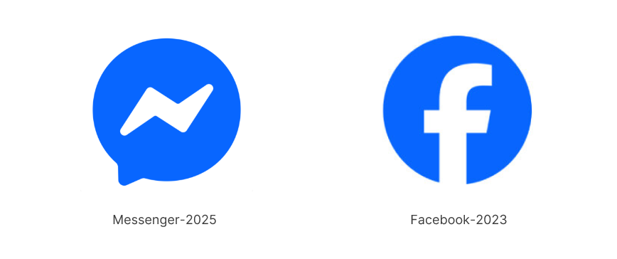
2025 returned to a solid blue design as part of Zuckerberg's "return to roots" initiative. This change reflects Meta's renewed brand positioning, suggesting that simplicity and recognition outweigh trendy design elements.
Strategic Thinking Behind Brand Visual Updates
The evolution of Facebook Messenger's brand identity reveals a key insight: visual design changes mirror company strategy.
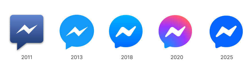
From the solid blue in 2018 (indicating close ties with Facebook), to the gradient design in 2020 (reflecting brand connection with Instagram), to the return to solid blue in 2025 (embodying the "return to roots" strategy), each change was based on clear strategic considerations.
This return to tradition demonstrates that simple, recognizable designs often carry more brand value than contemporary trends.
Other notable cases include
Apple's Brand Evolution
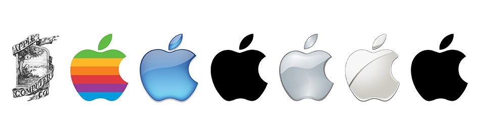
From rainbow apple to monochrome outline to today's dimensional design, reflecting Apple’s evolution from a niche tech company to a global design and innovation leader, with each logo iteration reinforcing its brand identity and adaptability
Microsoft's Window to Change
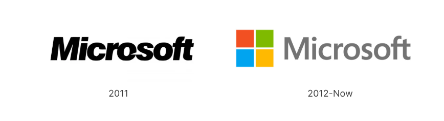
In 2012, after 25 years, Microsoft introduced a radical redesign of its logo to signal a new era for the company.
The four-colored Windows logo, still in use today, symbolizes the company's vision while representing its diverse software products.
The design exemplifies how a thoughtful logo can unify multiple business divisions under a single iconic brand.
Insights for Brand Founders
Facebook Messenger's brand evolution offers these key lessons:
Value Consistency: Ensure visual changes align with parent company branding
Simplicity First: Simple, recognizable designs tend to endure longer
Conclusion
The Messenger logo represents more than visual identity—it chronicles growth, innovation, and transformation. Each design iteration marks a distinct chapter in the brand's journey, showcasing its resilience and adaptability. The logo reflects not just Messenger's evolution, but the broader transformation of the tech industry.
For more tech logo inspiration, you can explore Free Logo Generator and check out Technology Logo Idea for inspiration