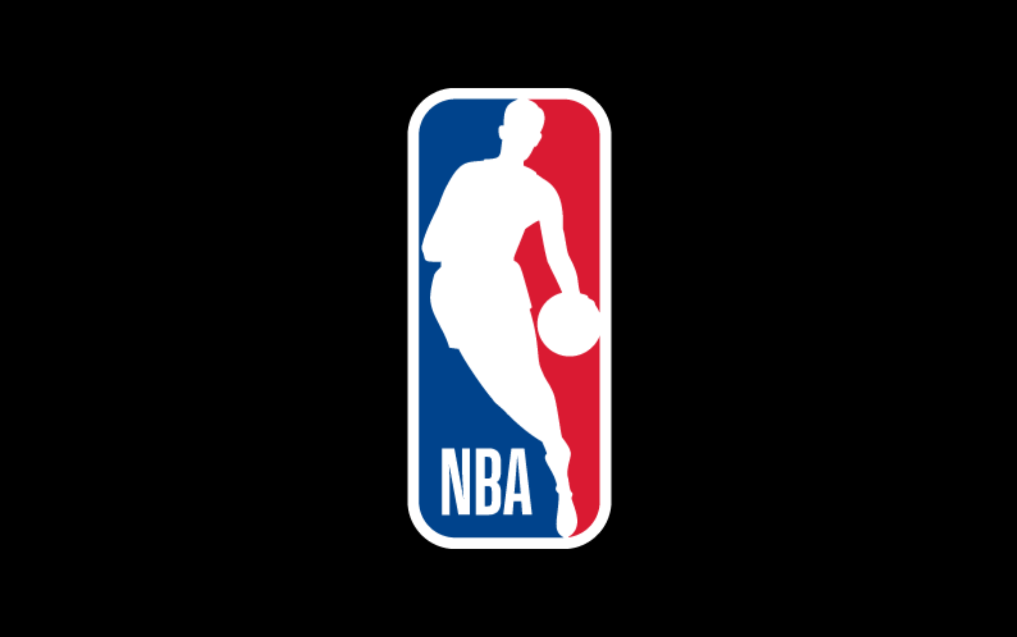
The NBA’s logo, featuring a simple yet powerful silhouette of a basketball player, has become one of the most recognized symbols in sports. But why did the NBA opt for this design? In this post, we’ll explore the evolution of the NBA logo, the advantages of an image-based logo, and other brands that have embraced similar design principles.
The Revolution of the NBA Logo
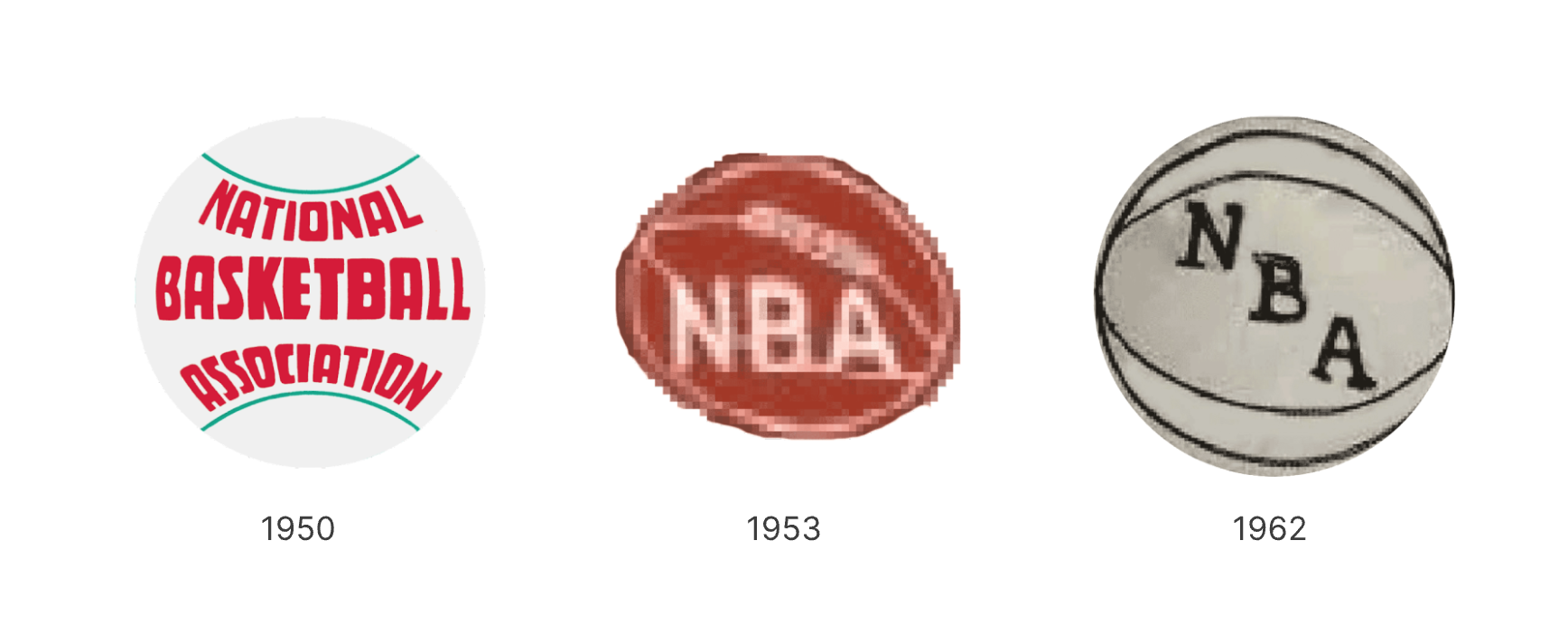
- The initial NBA l used the full name "National Basketball Association," until 1953, when it simplified to the "NBA" abbreviation with a cleaner, bolder font. Early NBA logos, whether the basketball was white, red, or gray, always kept the basketball as the core symbol, emphasizing its central role in the NBA brand.
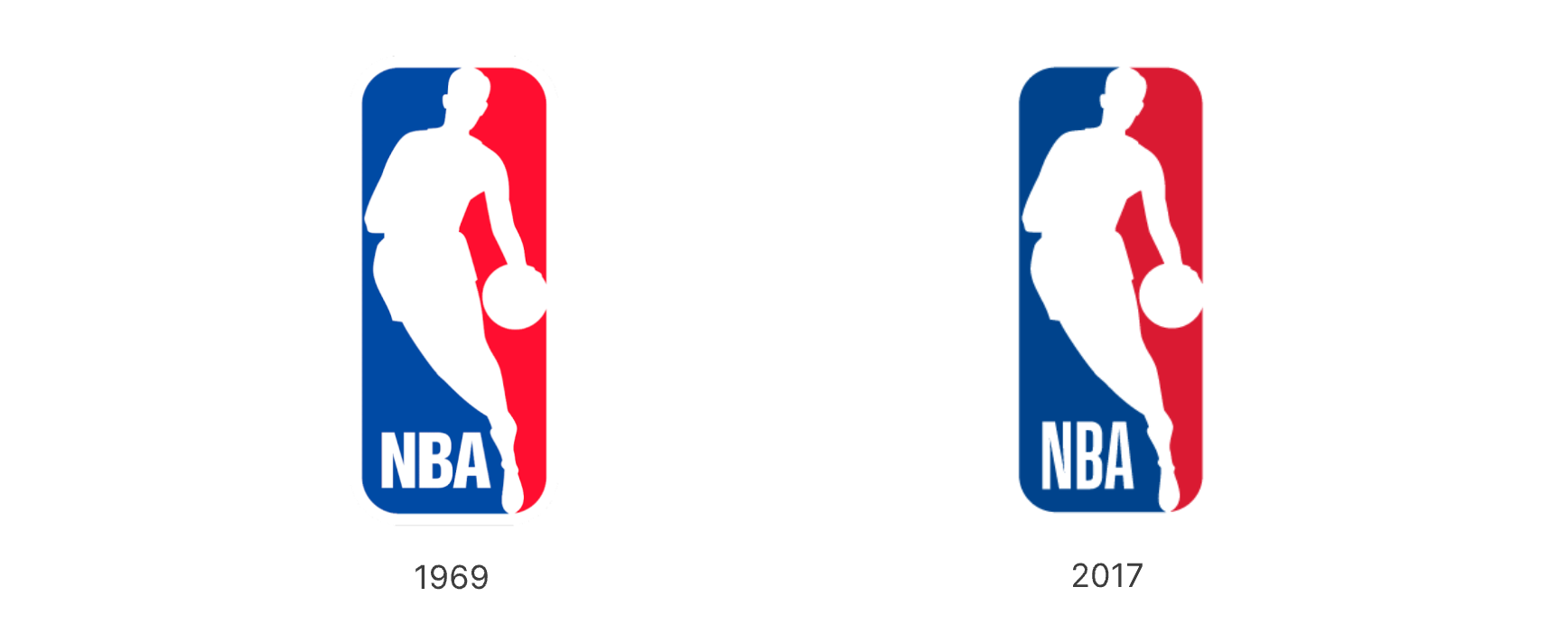
- In 1969, the NBA introduced its iconic vertical logo, featuring a rectangular emblem with rounded edges, blue and red sides, and a white silhouette in the center. The silhouette was a stylized image of Jerry West. The "NBA" letters appeared in the bottom-left corner, creating a cohesive design.
- In 2017, the logo was subtly refined with thinner, narrower lettering. This logo has become instantly recognizable, solidifying its status as an iconic symbol of the organization.
The Advantages of Image-Based Logos
- Simplicity and Recognition: Image-based logos, like the NBA’s silhouette, are universally recognizable and easy to reproduce across various media.
- Timelessness: Minimalist logos avoid trends that may become dated, making them suitable for long-term use. This is why the NBA logo has remained consistent for over 50 years.
- Versatility: Whether it’s printed on merchandise, displayed on screens, or used in digital formats, the NBA logo’s image design adapts well to different contexts.
Other Brands Using Image-Based Logos
For many brands, using a figurative image as their logo can bring their identity to life in a unique and memorable way.
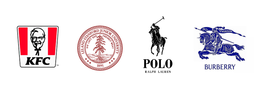
Think of KFC’s iconic founder’s portrait, Stanford’s tree crest, Ralph Lauren’s vintage polo silhouette, or Burberry’s armoured knight. Those logos are more than visuals—they tell stories and reflect brand identity.
Conclusion: A Legacy of Design Simplicity
The NBA logo is a prime example of how an image-based logo can stand the test of time, offering simplicity, recognizability, and versatility. Whether in sports or fashion, companies worldwide are embracing minimalist, image-driven logos to represent their brands.
Call to Action: Try Our Image-to-Logo Generator

Interested in creating your own minimalist image-based logo? Use our image-to-logo generator to transform your designs into professional-grade logos with ease. Try it now!